


WebApp Dev develops user-friendly Android applications for clients in USA
Our team of iOS developers have years of experience in developing scalable iPhone apps.
Globally acclaimed mobile app development agency for iOS & Android platforms.
The app store optimization services we provide helps increase your app’s downloads.
Explore the future of connectivity with WebApp Development, your partner in crafting cutting-edge IoT applications for a connected world.
We develop mobile applications using the react native framework for our clients in USA
Alluring designs and interface for your wearable applications
We have the best Flutter app developers who have expertise in development for clients in USA.
WebApp Dev’s team of game app developers deliver great designs and smooth gameplay to attract users.


Turning a Loyal Basketball Community into an Engaged, Paying User Base.
Building a Community-First App to Share and Swap Homegrown Produce
Revolutionize online shopping with WebApp Development's Shoppo, delivering tailored digital solutions for an immersive and efficient e-commerce experience.


Transform financial landscapes with WebApp Development, your partner in delivering innovative digital solutions for the banking and finance sector
Streamline your logistics operations with WebApp Development, delivering innovative digital solutions for enhanced efficiency and supply chain management.
Enhance travel experiences with WebApp Development, crafting innovative digital solutions for the dynamic world of travel and tourism
Transforming healthcare through innovative digital solutions – WebApp Development pioneers excellence in the health industry
Revolutionizing the dining experience – WebApp Development serves up tailored digital solutions for the restaurant industry
Redesigning real estate experiences – WebApp Development pioneers digital solutions that elevate property transactions and management.
Empowering financial innovation – WebApp Development crafts fintech solutions that redefine the future of the industry.
Transforming education through cutting-edge technology – WebApp Development pioneers digital solutions for a dynamic learning experience.
Revolutionize online commerce with WebApp Development, delivering seamless digital solutions for a thriving e-commerce experience.
Drive innovation in the automotive industry with WebApp Development, crafting tailored digital solutions for efficiency and growth.

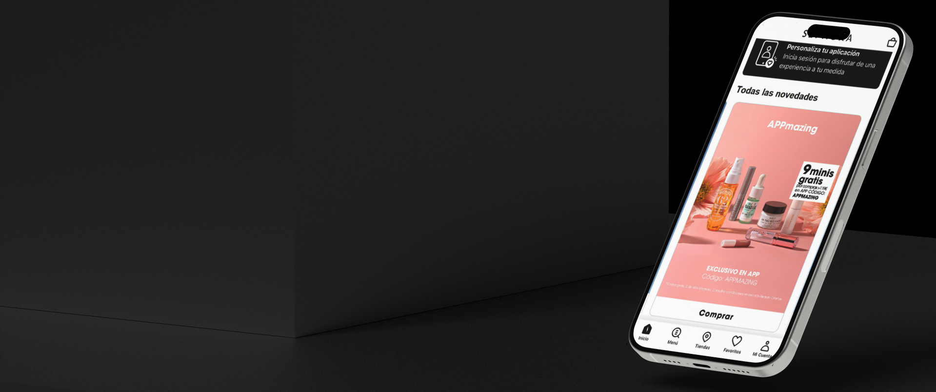
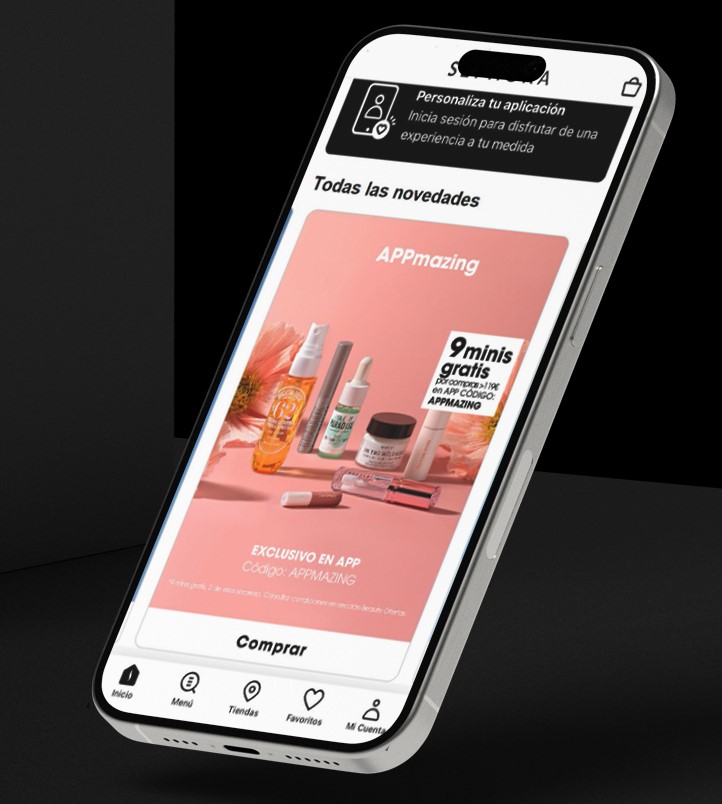
Sephora’s app struggled to turn brand strength into downloads, so WebAppDev applied a data‑driven ASO strategy, using keyword analysis and A/B testing to refine store copy and visuals.

Sephora is a global beauty retail powerhouse, operating both online and through thousands of stores across dozens of countries, offering cosmetics, skincare, fragrance, and wellness products.
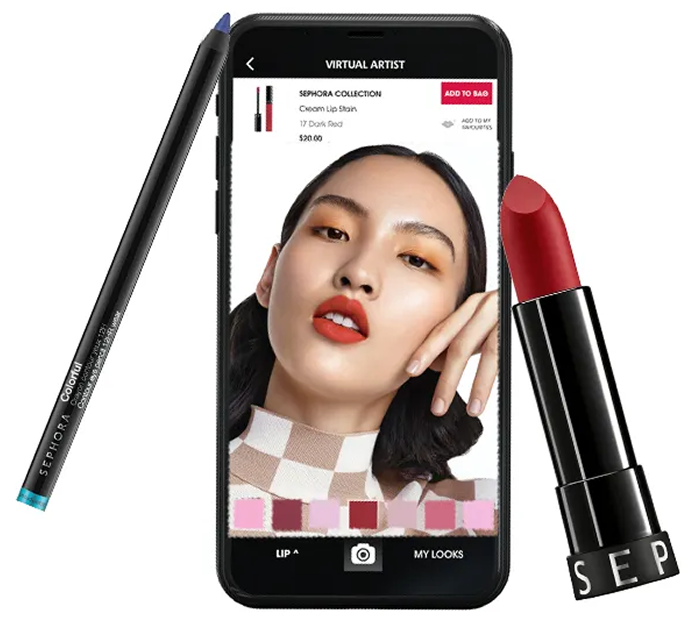
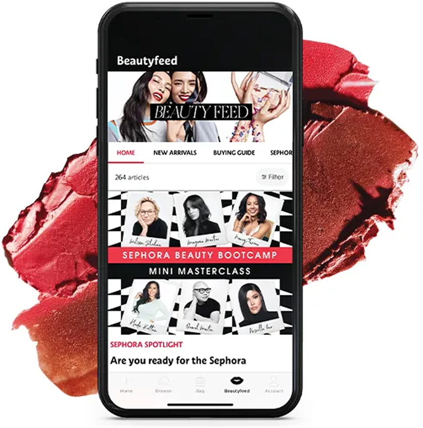
Their mobile app delivers a virtual shopping experience, allowing users to browse product tutorials, try-on makeup via augmented reality, shop directly, and build loyalty profiles.
Sephora consistently leads in digital innovation within beauty retail, combining ease of use, cutting-edge features (like Virtual Artist AR), personalization, and omnichannel integration.
Despite Sephora’s powerful global reputation, the mobile app wasn’t converting store visitors into downloads as effectively as it could.
The app’s ranking in the Apple App Store and Google Play left room for improvement, meaning it wasn’t surfacing for many high-intent beauty and shopping searches.
Key elements, such as short descriptions and screenshots, weren’t optimized, which meant they missed the opportunity to effectively communicate Sephora’s unique features, including AR try-on and exclusive collections, to potential users.
We created low-fidelity wireframes to outline the app’s foundational structure, focusing on three main tabs: onboarding, personalized feed, and community.
Once the wireframes were refined, we turned them into clickable prototypes. These prototypes helped stakeholders understand the flow early on and validate whether the user experience aligned with their core mission.
For the visual identity, we went with a soft, calming aesthetic, neutral tones, rounded UI elements, and clean, friendly typography.
We also built a modular design system, ensuring layout consistency across the app and making it easier for the VibeUp team to scale or update in the future.
Subtle, thoughtful notifications prompted users to take short mental breaks, helping them slow down and check in with themselves.
Based on each user’s preferences, history, and goals, the app suggested practices, communities, courses, and events, making every experience feel hand-picked.
We used visual cues to help users celebrate their small wins, reinforcing consistency and promoting positivity without pressure.
Social features were intentionally kept lightweight, think simple check-ins, reactions, and event discovery, to foster connection without the noise or anxiety of mainstream social platforms.
We built a backend module for wellness creators and small businesses to promote their events/services directly to targeted users, a win-win for personalization and monetization.
Increase in conversion rate on Google Play
Overall lift in conversion across store listing assets.
With Wall Street Mobile App’s ASO methodology, Sephora transformed its store listing from a passive storefront into a powerful growth engine. By prioritizing data-driven messaging and refining store copy, they turned existing visibility into meaningful conversions and elevated their presence in app stores.


